Fan Art
Moderator: EG Members
-
Chaos
- imanewbie
- Posts: 5
- Joined: Sat Apr 08, 2006 4:24 am
- Location: Standing behind you with a roll of duct tape and a box cutter
First, I'd like to say how awesome all these images are. The only part I don't like is I can't draw as well as the rest of you. Lol
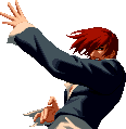
Seccond: Here's a pic for someone to CG, if they feel like it. I thought someone was taking requests, but I don't recall who and I don't feel like checking at the moment. Lol.
Image
Seccond: Here's a pic for someone to CG, if they feel like it. I thought someone was taking requests, but I don't recall who and I don't feel like checking at the moment. Lol.
Image
ogar555 was...I'm not sure the correct term would be taking requests, but he was certainly coloring a picture or two that people asked to be colored.
After everyone saw his talent with coloring the pictures they all wanted him to color something for them, but he's been busy so he hasn't had much time to frequent this topic, much less to sit down and color a page scan for anyone.
And as to Felony's post about the work I colored, I really was just dicking around with the shading. I'm sure there's areas that aren't in the correct area, and I really wasn't trying to make the tree look great with the shading. I just felt it needed some variation in color in different areas.
As far as the shading on the axe and the troll, it's more of an idea of light coming from the back of the Trolls head and coming down at an angle towards the axe. It still won't explain some of the shading, but I was mostly adding it for depth, and not to accurately portray the suns position or anything .
.
After everyone saw his talent with coloring the pictures they all wanted him to color something for them, but he's been busy so he hasn't had much time to frequent this topic, much less to sit down and color a page scan for anyone.
And as to Felony's post about the work I colored, I really was just dicking around with the shading. I'm sure there's areas that aren't in the correct area, and I really wasn't trying to make the tree look great with the shading. I just felt it needed some variation in color in different areas.
As far as the shading on the axe and the troll, it's more of an idea of light coming from the back of the Trolls head and coming down at an angle towards the axe. It still won't explain some of the shading, but I was mostly adding it for depth, and not to accurately portray the suns position or anything
Steeples scrape the sky, Praising God.
Everything here exists for God, is sacrificed to God.
For those who have nothing to sacrifice,
It can be a very heartless city indeed.
Everything here exists for God, is sacrificed to God.
For those who have nothing to sacrifice,
It can be a very heartless city indeed.
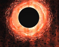
i think that image has too much black in it to color it nicely.Chaos wrote:First, I'd like to say how awesome all these images are. The only part I don't like is I can't draw as well as the rest of you. Lol
Seccond: Here's a pic for someone to CG, if they feel like it. I thought someone was taking requests, but I don't recall who and I don't feel like checking at the moment. Lol.
Image
=)


http://www.zarosaki.com/tutorials.html
from the guys that provide naruto scans with colour.
i think the tutorials are good.
from the guys that provide naruto scans with colour.
i think the tutorials are good.
-
EvilDmitri
- Mastered PM
- Posts: 139
- Joined: Mon May 29, 2006 8:43 am
- Location: Moscow


-
Buzkashi

- Devourer of Children
- Posts: 5727
- Joined: Wed Jan 12, 2005 12:23 am
- Location: Hiding from the flying beavers..
Did you make up that arrangement. Or was there a picture like it in the manga already. Cause it looks extremely familiar..
A little philosophy inclineth man's mind to atheism, but depth in philosophy bringeth men's minds about to religion.
-Sir Francis Bacon, Of Atheism <---Did I make this my sig? This shits gay as fuck.
-Sir Francis Bacon, Of Atheism <---Did I make this my sig? This shits gay as fuck.
no, i thought of the arrangement, i'm gonna put casca and the hawks in on the left and the godhand on the right i think and the brand in somewhere, Any suggestions before i paint?
i was going to start another tonight, maybe guts putting the dragon slayer through the millenium falcon but rather then the blade coming out the other side maybe just feathers or something, or maybe even nothing
i was going to start another tonight, maybe guts putting the dragon slayer through the millenium falcon but rather then the blade coming out the other side maybe just feathers or something, or maybe even nothing
-
MPD Psycho
- imanewbie
- Posts: 27
- Joined: Sat Apr 01, 2006 9:24 pm
i have to say out of all the fanwork i've seen so far yours is among the best. i like the bigger picture cause it gives a closer look into the detail of the feathers and what not. though the picky person that i am, the only thing that i see is that it seems guts' face is a little too wide...it could be the fading effect you have when he blurs into griffith.
yeah, gut's head is a little wide looking its because i havn't added his other eye and other things into the feather fade, i guess thats the next thing to do, as well as maybe adding some colour. i'll have some more for ya soon. your comments are definately appreciated keep em coming!!
need some more inspiration...
need some more inspiration...


-
Deathbringer
- n00b eater
- Posts: 852
- Joined: Fri Feb 17, 2006 8:03 pm
- Location: Portugal
Because the "Wolfo-Wölf" it's just my nickname in real life, just in case my fanart is included in the next release (My last name in spanish is "Lobo", so Wolf in english. A long story xD), while I use Linafae in forums. It's a habit I have, sorry for the confusion 
EDIT
By the way, I'm doing my second one, hope you like the work I've done until now

Cheers
Update:

EDIT
By the way, I'm doing my second one, hope you like the work I've done until now
Cheers
Update:
Last edited by Linafae on Sat Jul 15, 2006 9:04 pm, edited 2 times in total.

-
EvilDmitri
- Mastered PM
- Posts: 139
- Joined: Mon May 29, 2006 8:43 am
- Location: Moscow
Did this as practice in finishing techniques.. that puffball is from friggin hell, biggest pain in the ass ever and it still doesn't look right. Kept the background simple, bottom version is the same but without the glow (not sure about it). I run 2 monitors which messed with the coloring by quite a bit in my previous colorings (one is LCD the other is CRT, have different "color temperatures").. this time I colored on the CRT which looks better.


