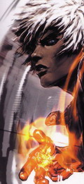
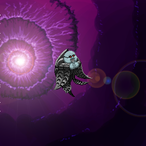
Heck yeah man. I like how Pippin has a broken Griffith on his back. Heh, Judeau, classic. Nice Ubik as well, like the background and such. Good attention to detail. Keep up the good work.
Are you going for a series of Mario going on a rampage drawings? I'd love to see a room full of those drawings, they never get old. Mega Man blowing Mario's right side looks awesome.
"Clearly my escape had not been anticipated, or my benevolent master would not have expended such efforts to prevent me from going. And if my departure displeased him, then that was a victory, however small, for me." - Raziel
War Machine wrote:Are you going for a series of Mario going on a rampage drawings? I'd love to see a room full of those drawings, they never get old. Mega Man blowing Mario's right side looks awesome.
You hit the nail on the head.
I'm pretty sure the next one is going to be Mario vs. Pac-Man.
Guess what happens when Mario meets a giant mouth.
"Clearly my escape had not been anticipated, or my benevolent master would not have expended such efforts to prevent me from going. And if my departure displeased him, then that was a victory, however small, for me." - Raziel
I was gonna copy and paste a bunch of new pictures but I've done so much new stuff that, at the risk of making this seem like a shameless plug, just go here and check it out yourselves.
There's Mario vs. Meat Boy/Heavy/Cloud/Slimes, a Mega Man 2 piece, Dragonball Z vs. Chrono Trigger and a bunch of original stuff.
Turn your piece into grayscale every once in a while just to see how your colors are contrasting with one another. If the grays are blending together too much, switch back to RBG and and change the brightness of your colors to add contrast.
Alternative, work completely in grayscale and add color later.
I've had mixed results with the latter approach.
DID YOU GUYS SEE MY POKEMON PIECE? IT'S REALLY COOL AND AWESOME!!
Well, as far as the actual colors go, I usually just use the eyedropper tool to pick the base color from a random image in Google if it's an existing character. For the shadows and highlights, I move the cursor in the color picker screen sorta diagonally down or up respectively. It's a good idea to change the hue slightly so like, say, if your base color is red, throw in a little orange if the lighting permits when going into a lighter shade.
If it's a character I made up or which I don't have any reference for, well, it's just a lot of trial and error really and I don't usually settle on color until the very last minute.
And, of course, once everything is flattened and ready to go, it's worth it to screw around with the levels and saturation for a bit.
I don't really know what other advice I can offer.
For the most part, most of the stuff I do in Photoshop is the result of me screwing around a lot and trying to find a method that works for me, or for whatever piece I'm working on in particular at least.