Fan Art

Evil_Genius' Berserk community, Kentaro Miura's epic masterpiece, still active and translated. (Please don't ask about older Volumes. Buy from DarkHorse and support Miura.)

Moderator: EG Members

User avatar
Albator
Hikikomori
Posts: 1226
Joined: Sun Nov 27, 2005 11:10 pm
Location: DC

Post by Albator »

http://mangahelpers.com/forum/index.php?topic=6878.0

For those who like a new desktop, the 2nd one is pretty cool IMO.
Image
User avatar
Sandman
Dirty Sennin
Posts: 2207
Joined: Thu Apr 28, 2005 9:25 pm
Location: Life is a bitch in bush Alaska

Post by Sandman »

If you say so :P
Image
Thank you sir, may I have another :twisted: :whip:
User avatar
MrFelony
E-Thug
Posts: 3284
Joined: Mon Mar 21, 2005 7:07 am
Location: In the middle of somwhere

Post by MrFelony »

pretty good. i think he should work on the the second one a lil more though
Image
User avatar
NoX
imanewbie
Posts: 10
Joined: Mon Jun 27, 2005 10:23 am
Location: Lithuania

Post by NoX »

Why ? I like the second more than the first one.
User avatar
Ellen
Beware my tactical spam
Posts: 411
Joined: Sat Feb 19, 2005 3:29 am
Location: Canada
Contact:

Post by Ellen »

Because of the addition of the 3 characters, it makes the space look empty, even though it's actually used more space than the first one. Looks unbalanced. Plus, according to the creator's comment, I refuse to believe he would serpico/isidoro on his mind more often than Caska
Image
User avatar
boffen
imanewbie
Posts: 6
Joined: Mon Aug 07, 2006 1:54 am
Location: Sweden

Post by boffen »

hey dudes and dudettes, im Boffen the dude that made those 2 desktops and i was just a little puzzled about some stuff
Ellen wrote:Because of the addition of the 3 characters, it makes the space look empty, even though it's actually used more space than the first one. Looks unbalanced. Plus, according to the creator's comment, I refuse to believe he would serpico/isidoro on his mind more often than Caska
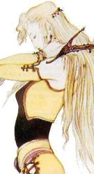
uhm did you see the entire picture? the characters that have been added are: Griffith, Femto, Zodd, Skull Knight, Serpico, Puck, Isidro, Farneze, Shierke, Irabella and of course Caska. i was thinking of putting in the old Band of the hawk too but that would be to much in my opinion.
MrFelony wrote:pretty good. i think he should work on the the second one a lil more though

ok, uhm with what? suggestions are welcome. Im new to both Photoshop and desktopmaking so all tips are welcome!
Last edited by boffen on Mon Aug 07, 2006 10:45 am, edited 1 time in total.
User avatar
psi29a
Godo
Posts: 5386
Joined: Tue Jan 11, 2005 2:52 am
Location: The Lonely Mountain
Contact:

Post by psi29a »

Welcome aboard boffen! :D Glad you made it on over, hope the positive critiques are welcome.
User avatar
boffen
imanewbie
Posts: 6
Joined: Mon Aug 07, 2006 1:54 am
Location: Sweden

Post by boffen »

thanks for the welcome, yeah i got no problem with critiscism(or however you spell that), it was just that i couldnt really understand it. anyways im working on a few more berserktops so ill post them here too when they're done!
User avatar
Femto
Devourer of Children
Posts: 5784
Joined: Wed Dec 13, 2006 11:58 pm
Location: 127.0.0.1
Contact:

Post by Femto »

The first one is better.

In the second one, it feels like you added those other characters just for the sake of filling up space.

The first one seems more complete in that sense.
User avatar
evilester_me
This is my new home
Posts: 227
Joined: Tue May 24, 2005 4:37 am
Location: San Francisco

Post by evilester_me »

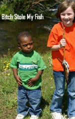
http://i5.photobucket.com/albums/y193/p ... le0007.jpg

thats my only fan art, and I learned my lesson from it too.

Art + Evilester_me = :wtf:
:wink:
User avatar
MrFelony
E-Thug
Posts: 3284
Joined: Mon Mar 21, 2005 7:07 am
Location: In the middle of somwhere

Post by MrFelony »

or the lesson you could receive is that at the moment you aren't as good as some other people, but with diligence you could be :P
Image
((Jota))
imanewbie
Posts: 2
Joined: Mon Aug 14, 2006 1:23 am
Location: BA, Argentina

Post by ((Jota)) »

My first "fan art". Hope you like it

Image
User avatar
Buzkashi
Devourer of Children
Posts: 5727
Joined: Wed Jan 12, 2005 12:23 am
Location: Hiding from the flying beavers..

Post by Buzkashi »

Finally some more fan art. I like. Some parts are hard to make out though. But still that shit is strait as hell.
A little philosophy inclineth man's mind to atheism, but depth in philosophy bringeth men's minds about to religion.
-Sir Francis Bacon, Of Atheism <---Did I make this my sig? This shits gay as fuck.
User avatar
Brainpiercing
Crusher of Dreams
Posts: 1717
Joined: Tue Jan 11, 2005 9:29 pm
Location: somewhere far beyond

Post by Brainpiercing »

Freaky.

In a really good sort of way....
Brainpiercing
"Beer cures poison" - (almost) Guts.
Image
User avatar
MrFelony
E-Thug
Posts: 3284
Joined: Mon Mar 21, 2005 7:07 am
Location: In the middle of somwhere

Post by MrFelony »

i def think it captures the rage ;)
Image
Tetnubis
imanewbie
Posts: 12
Joined: Sat Apr 15, 2006 11:46 pm

Post by Tetnubis »

Very nice Jota [is it the same one from ST?].

Colours are great IMO. I think it needs some blending work with the bottom left picture of Gutts tho', you can see where it has been cut from th epage. Other than that good job.
Image
User avatar
Sandman
Dirty Sennin
Posts: 2207
Joined: Thu Apr 28, 2005 9:25 pm
Location: Life is a bitch in bush Alaska

Post by Sandman »

Here is my new sig in its origanal form, what do you guys think?

Image

I am going to color Zodds Sig size panel on the same page and try make a transition with text or something.
Image
Thank you sir, may I have another :twisted: :whip:
User avatar
Buzkashi
Devourer of Children
Posts: 5727
Joined: Wed Jan 12, 2005 12:23 am
Location: Hiding from the flying beavers..

Post by Buzkashi »

It looks like you colored it decently but then grabbed the smudge tool and wreaked havoc.
A little philosophy inclineth man's mind to atheism, but depth in philosophy bringeth men's minds about to religion.
-Sir Francis Bacon, Of Atheism <---Did I make this my sig? This shits gay as fuck.
((Jota))
imanewbie
Posts: 2
Joined: Mon Aug 14, 2006 1:23 am
Location: BA, Argentina

Post by ((Jota)) »

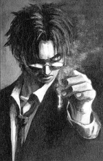
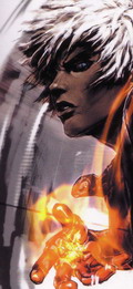
Tetnubis wrote:Very nice Jota [is it the same one from ST?].

Colours are great IMO. I think it needs some blending work with the bottom left picture of Gutts tho', you can see where it has been cut from th epage. Other than that good job.


Hi Tet. I'm the same one.
Thanks for the advices. I'll try to fix the mistakes!
Tetnubis
imanewbie
Posts: 12
Joined: Sat Apr 15, 2006 11:46 pm

Post by Tetnubis »

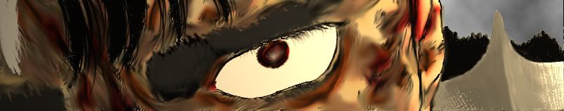
@Sandman, Pretty good, but i have to agree with Buzkashi, the smudge tool is overused. Have you ever tried out Corel Painter? [Im assuming that you are using Photoshop].
Painter has a nice "Just Add Water tool" that i think would benifit as opposed to smudge.

I do like how you did the eyebrows tho', maybe another layer of black [suttle] ontop would add for even more realism. You might also want to rid the picture of the odd dots in the hair.
It works pretty well as a sig, but you should add a border. :)

@Jota, good t' see you around. Be sure to send me the re-edited version.
Image
User avatar
Sandman
Dirty Sennin
Posts: 2207
Joined: Thu Apr 28, 2005 9:25 pm
Location: Life is a bitch in bush Alaska

Post by Sandman »

How about this one

Image
Image
Thank you sir, may I have another :twisted: :whip:
User avatar
BigSassy
Mastered PM
Posts: 104
Joined: Tue Jan 25, 2005 6:35 pm
Location: Rockville, MD

Post by BigSassy »

Dig it :thumb:

But if you look real close the fur is a little muddy / blurry. Smudge tool again?
User avatar
Sandman
Dirty Sennin
Posts: 2207
Joined: Thu Apr 28, 2005 9:25 pm
Location: Life is a bitch in bush Alaska

Post by Sandman »

Used a different strength and brush this time I liked it a lot better, and I think I nailed the eye, not to toot my own horn :roll:
Image
Thank you sir, may I have another :twisted: :whip:
User avatar
MrFelony
E-Thug
Posts: 3284
Joined: Mon Mar 21, 2005 7:07 am
Location: In the middle of somwhere

Post by MrFelony »

ya the eye is pretty good, but the fur is still smudged :P
Image
User avatar
Sandman
Dirty Sennin
Posts: 2207
Joined: Thu Apr 28, 2005 9:25 pm
Location: Life is a bitch in bush Alaska

Post by Sandman »

Its full of blood and has been burnt by lighting, your hair would look smuged too eheheh JK :twisted:
Image
Thank you sir, may I have another :twisted: :whip:
Post Reply