Page 45 of 61
Posted: Wed Nov 15, 2006 5:25 pm
by sliverstorm
I registered just to say fantastic work to the lot of you, Ollie and Ogar in particular. The colors look fantastic, and even those of us who do little more than leech and seed definitely appreciate them.
NOt as the last one.
Posted: Thu Nov 16, 2006 4:26 pm
by mwraiden
I'm not as skillful as the last guy, but I think this still is worth to be posted... anyway, here is my work(sorry if you dont have broadband =S).
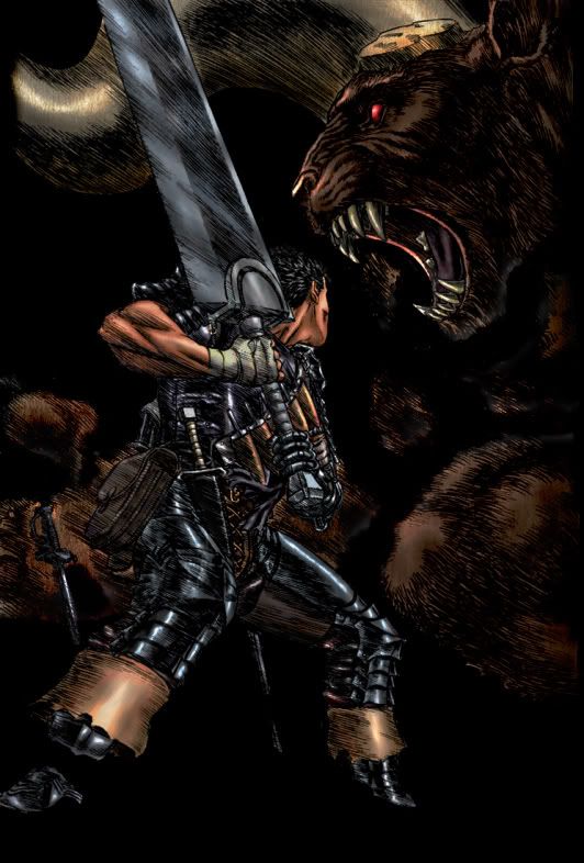
I'd like to make and post some others but my crappy university dont give me a single second of relax. damn it!
Posted: Thu Nov 16, 2006 4:52 pm
by Gundam_Bobcat
Its a little dark,
Other than that its really good.
I thought that battle happened when it was snowing.
Posted: Thu Nov 16, 2006 5:14 pm
by EnglishJim
Yeah, that was the battle on the hill of swords and it was snowing.
That said, your art is great. It is a little dark, but the lighting effects on the armor give it that metalic finish, which looks cool.
The only other thing I could see was that you didn't color the whole picture

.
Posted: Thu Nov 16, 2006 5:38 pm
by mwraiden
Both of you are damn right.. I forgot to say it was supposed to be in the snow... Anyway, that's something I made during some sparetime I had, and I thought that a dark picture was more accurated of a berserk art(I just wanted a dark berserk colored thing).
More to come is a sure thing(but not in brief period), and having in mind your comments indeed.
Glad you liked it (or at least accepted it).

Posted: Thu Nov 16, 2006 5:52 pm
by Aeriel
Apart from darkness, it is very good. I especially like what you did with Gutts' skin!

Posted: Thu Nov 16, 2006 5:57 pm
by Sandman
Its great, even without the snow, the only thing I would change is the background, but other then that you coloring is great.
Posted: Thu Nov 16, 2006 9:53 pm
by Starnum
Oh, yeah, I see what you were going for. I like it!
*click* Save-as
Posted: Fri Nov 17, 2006 1:31 am
by Sandman

Felt like Coloring again
Edit: switched hosting sites
Posted: Fri Nov 17, 2006 4:23 am
by MrFelony
for some reason that SK seems like it was from adult swim...i have no idea why
Re: NOt as the last one.
Posted: Fri Nov 17, 2006 6:31 am
by Dagda Mor
mwraiden wrote:I'm not as skillful as the last guy, but I think this still is worth to be posted... anyway, here is my work(sorry if you dont have broadband =S).
[img]awesome[/img]
I'd like to make and post some others but my crappy university dont give me a single second of relax. damn it!
Don't sell yourself short, that's a great picture! The darkness may change the tone of the picture, but in a negative way? I'd seriously disagree.
Posted: Fri Nov 17, 2006 4:29 pm
by Gattsblackfalcon
Nice work I like it , great colouring specially Gatts skin color and armor too looks very good .
Btw Sandman why your pic link send me to dumpalink ? I really want to see that pic man .
Edit: Hey Sandman can I use that little SK pic as my avatar?

Posted: Fri Nov 17, 2006 5:02 pm
by Brainpiercing
It's a great coloring, mwraiden. I especially like how the lineart was really seamlessly integrated into the colors. I don't think I've seen that done quite as well yet.
Posted: Fri Nov 17, 2006 5:06 pm
by MrFelony
yea you did a really good job coloring, so lets see some more

Posted: Fri Nov 17, 2006 6:20 pm
by Sandman
Gattsblackfalcon wrote:Nice work I like it , great colouring specially Gatts skin color and armor too looks very good .
Btw Sandman why your pic link send me to dumpalink ? I really want to see that pic man .
Edit: Hey Sandman can I use that little SK pic as my avatar?
Thought you might like that, anyway feel free to use it, I am back to the drawing board... I wonder why Photoshop doesnt have a blender brush, it very cool and useful and it is the one main reason I like Corel better... but my licence has ran out on this computer so I have to use my computer at home, oh well I am not about to shell out $329 for that program... I should look for it one a free programs site

Posted: Sat Nov 18, 2006 3:26 am
by EnglishJim
mwraiden wrote:Anyway, that's something I made during some sparetime I had
If you did that in your spare time I wonder what you could do if you were really trying, you should post some more
.
Looking through this thread, I see a lot of great work. I'm interested to know what programs you all use.
It seems Corel Paint Shop/Photo Shop is the most popular...
Posted: Sat Nov 18, 2006 9:45 am
by Sandman
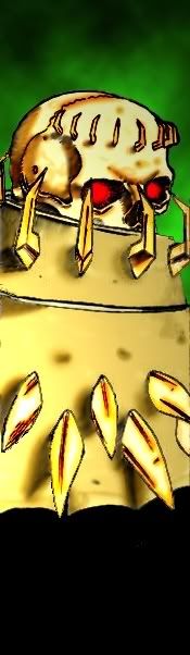
Here is what my av was taken from
Posted: Sun Nov 19, 2006 10:18 am
by Skullkracker
MY EYES!!!
Posted: Sun Nov 19, 2006 1:33 pm
by Sandman
How about this version??
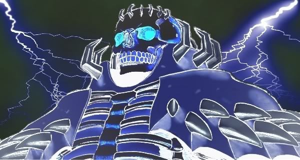
I was messing around with negetives if you couldnt tell
Posted: Sun Nov 19, 2006 9:31 pm
by Skullkracker
electrocuted...niiice
I like it more, but that is probably due to the fact that blue is one of my favourite colors
Don't think that I'm teasing you just for fun. You have done better coloring, and Skull Knight is not that bright a fellow, he should look more...gloomy
his armor is definately not golden
I'm finished with my thoughts here, my brain just expired, I need to subscribe to a new and updated version
Posted: Mon Nov 20, 2006 1:15 am
by Sandman
I tryed to get him to look bone looking... but with playing with the equilizer I think I lost that, and also I wanted a skeletor look to him I guess but I dont know I have looked at a loot of colorings of SK and I have not liked most of them... oh and the brightness was because in that panel he is talking about how he is the lght that fights against the dark so that might have contributed to the light issue

Posted: Mon Nov 20, 2006 2:18 am
by Fuji Nagase
i love that coloring mwraiden, it looks great. i actually like it this dark,but maybe subtle value changes in the background could help guide the eyes elsewhere?
that skullknight picture is awesome!
Posted: Mon Nov 20, 2006 5:40 am
by EvilDmitri
Tried a more realistic shading pattern.

I also got bored and turned it into my new desktop background

Enjoy.
Posted: Mon Nov 20, 2006 8:43 am
by Sandman
I like it, very well done... if your using photoshop, experiment with the grass brush it looks very hair like
Posted: Mon Nov 20, 2006 9:21 am
by EvilDmitri
Sandman wrote:I like it, very well done... if your using photoshop, experiment with the grass brush it looks very hair like
I considered using a brush like that for the fur cape, but it probably wouldn't show up too much through the lineart. It's really the only thing I would consider changing on the piece though, other than maybe the background. I'll play around with it tomorrow - now that I look at it, it is far too light. I'm going to make it very very dark yet with traces of light to make it look gleaming as if dipped in oil.
