Page 34 of 61
Posted: Thu Jun 22, 2006 11:13 pm
by Sandman
That is some cool shit you got there (wouldnt call it "Fan Art " but awesome statues no-the-less)
I tryed to step it up a notch and try something new to me...
I know what your going to say "where did Guts get his black lips??" ha ha ha very funny had a hard time with coloring the mid and dark tones of the lips.
Posted: Fri Jun 23, 2006 1:47 am
by EvilDmitri
I haven't seen much in terms of Skull Knight for colorings.. so I thought i'd give it a shot. My first attempt at a full page.
This is full size so the detail shows (as do the mistakes ~_~). Sorry it's huge

.

Posted: Fri Jun 23, 2006 7:11 am
by a-choo
Wow awesome, I wish I had the patience to color too

Now time to post some of my garbage

Hope ya'll like it!

I originally wanted to draw Caska with her armour on, but it was beyond me.. so I went with a shirt instead *lazy*

Posted: Fri Jun 23, 2006 8:32 am
by Buzkashi
It looks like you did some coloring for the skin.
Overall its pretty nice.
Posted: Fri Jun 23, 2006 7:22 pm
by Skullkracker
Oh my!
Great work both of you!

Posted: Fri Jun 23, 2006 8:39 pm
by Deathbringer
Skullkracker wrote:Oh my!
Great work both of you!
Quoted for truth.
Posted: Sun Jun 25, 2006 1:57 am
by Thegreensquid

A Gatsu vs Zodd painting.
The guy who taught/ is teaching me painting is an impressionistic painter, painting only the details that NEED to be painted, and letting the rest just fall off and letting the mind fill in the blanks. I personally like the style, it's interesting, but so many people are so detail oriented that the style might not appeal to them. That's fine. So if you are a detail oriented person, and this offends your eyes, my apologies.
edit:
Do you know a master named Brom? His drawings are the exactly definition of perfect (yet wicked) drawing. He uses dark colors, and his anatomy is just perfect. Take a look at some of his drawings to get 'color inspiration'...
That drawing you posted of his reminds me alot of Frank Frazetta's work.
Posted: Sun Jun 25, 2006 2:18 am
by Buzkashi
Thats pretty sweet man. Nice stuff.
Posted: Sun Jun 25, 2006 3:11 am
by Albator
Aaaaah original work....This is release-bound for next month

Posted: Sun Jun 25, 2006 8:28 am
by MrFelony
I like your sig a lot sand. I also thought you did a pretty good job on one of your earlier pieces (i think it involved a lot of fire...) if you fixed the eyes and and lips on your avatar i think it would look a LOT better. it looks pretty good now, i didnt even notice the lips until you mentioned them, but if those two things were touched up on it would look that much better. did you try adding a lil pink in the lips? honestly i think brown lips look a little wier. also the way the lips look, it seems smudged on like paint. when miura draws his lips you can see the distinction between the lips and the rest of the face. you could try maybe making that clearer...also i thought the eye could use a little smoothing out. the pupil nad the area around it are too jagged. i also seems that you "drew outside of the lines" with the white...anyway hope some of this helps

. you're definitely getting more experienced lol

Posted: Sun Jun 25, 2006 2:23 pm
by Eldo
I have to say that fucking rocks.
Posted: Sun Jun 25, 2006 10:36 pm
by Brainpiercing
It sure rocks....
but as an impressionist painting it looks very much like Zodd is an angry rabbit. Hmmm.
Posted: Sun Jun 25, 2006 11:15 pm
by Sandman

I knew it looked like something but I couldnt put my finger on it
Anyway thanks for the comps. and critics, I will try fix the lips and the eyes on monday, I think I am just going to clone some new lips in and smooth the eyes.
Posted: Mon Jun 26, 2006 2:32 am
by Deathbringer
Brainpiercing wrote:It sure rocks....
but as an impressionist painting it looks very much like Zodd is an angry rabbit. Hmmm.
Wow, my brother said this exact same quote.
Posted: Mon Jun 26, 2006 12:32 pm
by Brainpiercing
Deathbringer wrote:Brainpiercing wrote:It sure rocks....
but as an impressionist painting it looks very much like Zodd is an angry rabbit. Hmmm.
Wow, my brother said this exact same quote.
That must mean your brother is smart.
Quoting me always means people are smart.
Posted: Mon Jun 26, 2006 5:33 pm
by Skullkracker
It was cool putting those fan arts to the end of the latest chapter. They really were worthy!
Posted: Tue Jun 27, 2006 12:32 am
by Sandman
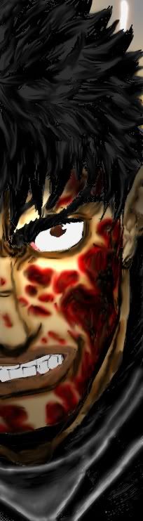
Had to redo the pic in HQ scan so better or worse?
Posted: Tue Jun 27, 2006 6:17 am
by MrFelony
it looks good. i especially liek the crispy piece of flesh thats coming off on his cheek lol. though the white part of hist hair seems a little globbed on..atleast thats what it seems like to me...it could be the fact that it is almost pure white without enough detail...maybe its just me heh. though you are assuredly improving, im just a little picky
Posted: Tue Jun 27, 2006 10:04 am
by Brainpiercing
True, the white bit of hair needs just a little more structure.
Posted: Tue Jun 27, 2006 10:34 am
by EvilDmitri
Marked improvement, Sandman!
I'm still a noob myself.. i'm going to start my 2nd full page sometime today, i've already got it prepped
it's a page from Volume 14.. which one it is will be a suprise ^.^
Posted: Tue Jun 27, 2006 4:08 pm
by newbified
Posted: Tue Jun 27, 2006 5:06 pm
by MrFelony
i like your choice of colors. i think one of the things you could try and work on is making the teeth different shades of yellow... though thats just me in my picky critical sort of way
(imagine what my gf has to go through haha...though im not really that bad im just trying to be helpful...
). and i have a question about shading. since it seems like the light is coming from above the axe and from i guess the readers perspective, would the spike on the back of the axe have shadow on it at all?
here are some quick thoughts of mine about where the light is coming from...feel free to tell me if im wrong cause im not very experienced in drawing, but from looking at what i think is miura's shading this is what i thought...

Edit: the "light source?" is what i think may be a different perspective of where the light is coming from and the "light source" is what i think your lightsource may be...for the close up i think my lines are off...i think the more ominous shading the better. also i used the spray to show wher ei think you might have some shading off. it doesnt make sense to shade the top of a branch when it seems that the bottom of the branch is what should be shaded...but as always correct me if im wrong
Posted: Wed Jun 28, 2006 11:24 am
by EvilDmitri
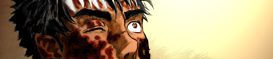
My latest waste of time and 2nd full page coloring.
It didn't turn out quite as well as I was hoping it would (couldn't get the tree right) but i'm proud of the lighting on the skin. The Skull Knight image didn't have enough open area to really make effective use of shading so I focused on details in that one, such as the cracking and age in the armor (the horse's skull was the only part that could really be shaded well). I did this entire piece in one sitting.. so my ass hurts, i'm tired as hell (stayed up all night), and will bother with fixing it later if I notice something wrong ~_~.
Full size again, feel free to scoff at the mistakes.

Posted: Thu Jun 29, 2006 7:01 pm
by Sandman
Not bad, but a couple of things, background needs to be a little darker and less purple and what happend to the fairies faces?? besides that it looks good IMO, but I would have changed glow for the little fairies to contranst their hair color
Posted: Thu Jun 29, 2006 8:08 pm
by EvilDmitri
The fairies are a more minor part of the image and in the original peice they lack faces as well, which was most likely done to push attention away from them and towards the centerpiece. Also, the glow does contrast their haircolor. Did you mean compliment?
