Page 24 of 61
Posted: Fri Apr 21, 2006 8:14 pm
by Buzkashi
Great Scott. Thats awesome man.
Posted: Sat Apr 22, 2006 3:06 am
by jac-k
Ah, thanks. Decided to work on it more, but I need to go on a hiatus because of AP tests.
Posted: Sat Apr 22, 2006 4:25 am
by mrbright
jac-k wrote:Ah, thanks. Decided to work on it more, but I need to go on a hiatus because of AP tests.
Hey thats really cool. hmm does any one know the ethnicity of Casca?
Posted: Sat Apr 22, 2006 5:46 am
by Starnum
Nope, as far as we know she's from Midland like everyone else. Although, it is strange that she has the same type of complexion as the Kushan. There's no telling really.
Posted: Sat Apr 22, 2006 12:27 pm
by Albator
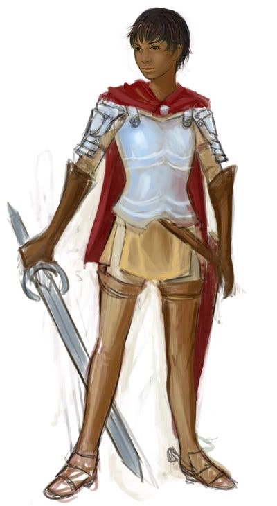
Ugh my eyes....it.s toooo.....pretty.....Me....want more!
Seriously jac-k, I'm glad you came on this forum. How much time does it takes youn to draw somethink like this? Is it a lot of work?
Posted: Sat Apr 22, 2006 3:30 pm
by jac-k
Well that pic, including the head, took about 2 hrs? It's not a lot of work, that is for a simple pose, since I do a lot of sketches/study anatomy (

), etc.
Posted: Sat Apr 22, 2006 8:08 pm
by ogar555
Hello and well met! First post in this here forum, but most probably not the last. Anyhow, jac-k that looks great sofar! I'm surprised you're so good at such a young age!

Keep it up!
Posted: Sat Apr 22, 2006 11:44 pm
by Eldo
jac-k wrote:Well that pic, including the head, took about 2 hrs? It's not a lot of work, that is for a simple pose, since I do a lot of sketches/study anatomy (
), etc.
If you have more artwork, feel free to post them here. You can post a full sized image in link form too.
Posted: Mon Apr 24, 2006 10:37 pm
by Sandman
Like that Picture of Casca... Looks younger then Miura's Caska
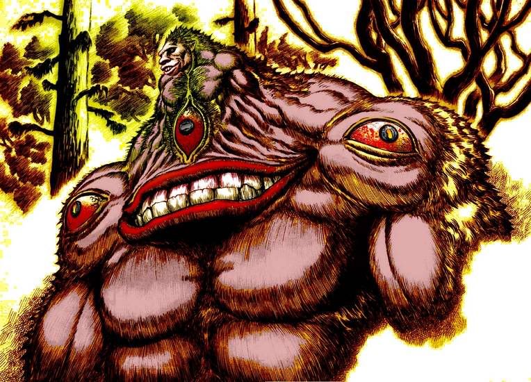
Colored this because I Have been reading Volume 11 lately and I needed to color this ape pink!!!

Pussy ass pink Ape

Posted: Tue Apr 25, 2006 2:36 pm
by Devil_Dante
you've gotten better? I like the red coloring on the eyes, and the yellow stuff on the trees.
Posted: Tue Apr 25, 2006 5:18 pm
by Deathbringer
That picture made me remember that Wyld (sp?) has got to be the only character from a manga which i *really* hated, never been so satisfied to see a fictional character dying.
Posted: Tue Apr 25, 2006 5:41 pm
by Quest
wow, sandman.
you are getting better at it.
there is a marked difference from your previous works.
=)
Posted: Tue Apr 25, 2006 8:55 pm
by Sandman
Thanks for your comments, I would also like to thank Miura for drawing such a cool picture

it was an honor to color it

.... now whats next??
Posted: Wed Apr 26, 2006 11:17 am
by Starnum
Indeed, keep up the good work man. There's only room for improvement. As for Wylde, he was a bastard, but I really enjoyed his fight with Gatts. Oh, and seeing him die brought me great satisfaction as well, heh.
Posted: Sun Apr 30, 2006 6:55 am
by Fuji Nagase
i like the caska pic, it has a very calm mood to it.
Posted: Sun Apr 30, 2006 5:48 pm
by MournfulWoods
I did a bit of photoshopping.
I got a old computer screen though so if the tones aren't dark enough, that's 'cause I see them darker.

Posted: Sun Apr 30, 2006 5:53 pm
by Quest
wow you must have arrived at that from like 5 different sources.
Posted: Sun Apr 30, 2006 5:59 pm
by MournfulWoods
Well the trolls and ogre I took from Volume 25, the background I found on the net in «public domain» sites and the Guts picture is taken from a berserk figurine shop ( a link I found on the Young Animal website). There's also an abstract drawing on the left side. It's a drawing I did and then scanned.
Posted: Mon May 01, 2006 3:03 am
by SarahofBorg
Hmm, I've been thinkin of makin a sig for me on this board. I have some photoshop skillz but little experiance. All I need now is ideas.
Yhea, I don't have crap yet, but if I make something I'll post it here and make it my sig. I figure I'll start off by finding a nice panel from the manga and color it, although I'm also new to that.
Any advice on how to color scans would be much appreciated.
-Sarah of Borg
Posted: Mon May 01, 2006 3:11 am
by Gundam_Bobcat
I don't know MournfulWoods, something looks a little wrong with that picture that you posted, to me Guts just doesn't fit in.
Other than that, you do some great work, I'm still trying to master Photoshop.
Posted: Mon May 01, 2006 3:48 am
by MournfulWoods
SarahofBorg wrote:Hmm, I've been thinkin of makin a sig for me on this board. I have some photoshop skillz but little experiance. All I need now is ideas.
Yhea, I don't have crap yet, but if I make something I'll post it here and make it my sig. I figure I'll start off by finding a nice panel from the manga and color it, although I'm also new to that.
Any advice on how to color scans would be much appreciated.
-Sarah of Borg
I don'T really color pictures but I guess you could go in photoshop and change the layer type to «multiply». Then you color on a layer under the panel you chose.
Gundam_Bobcat wrote:I don't know MournfulWoods, something looks a little wrong with that picture that you posted, to me Guts just doesn't fit in.
I guess that would be because Guts isn't a drawing like the trolls around. Or maybe it's his stance you don't like ? It's my first attempt at a berserk fanart. I've done better stuff with photoshop.
Posted: Mon May 01, 2006 4:30 am
by SarahofBorg
OK, believe it or not this is the first time I've ever colored a manga scan. I have colored images before though. I chose something cool, and I think I'm gonna make this my avatar
It's not nearly as cool was what I've seen here, so I'd love advice from those who've done coloring with photoshop. I choose something simple with few colors or textures on purpose because I don't have a clue how to do something fancier.

Kewl, eh?
-Sarah of Borg
Posted: Mon May 01, 2006 4:37 am
by SarahofBorg
Can some1 help me out? Why does the image look like crap when I resize it to avatar size? What's the best way to resize it with photoshop (I have the settings on "nearest neighbor.") I keep losing too much detail.
[edit] nevermind, it Was that "nearest neighbor" crap. Screw my photoshop teacher, who told me that was the best way.
-Sarah of Borg
Posted: Mon May 01, 2006 5:00 am
by Ayanami
The Skull looks okay. Needs more contrast. I am not a photoshop expert, so I can't really help ya out. May want to ask Sandman for that noise.
Any way, we have edit buttons. Please avoid double posting. It is one rule we can be pretty anal about here at Mindwerks. When you want to make another post to revive a thread, just copy the old post to the clip board, delete it, then make a new post, paste the old post from the clip board to the new post and put what ever else you have to say on that post. Or just edit your old post considering this thread was not really dead.
Posted: Mon May 01, 2006 5:07 am
by SarahofBorg

hey it's my first time, I thought the skull was more than OK, but I guess in comparison to the talent around here it's nothin special.
Alright, I won't double-post again, just edit the previous post. No big deal, just not used to it.
So what do you mean, the colors should contrast more, or that it doesn't have enough detail? Not sure what you mean, any help is appreciated.
-Sarah of Borg
 ), etc.