Fan Art
Moderator: EG Members


-
Sandman
- Dirty Sennin
- Posts: 2207
- Joined: Thu Apr 28, 2005 9:25 pm
- Location: Life is a bitch in bush Alaska
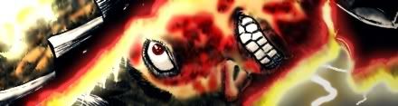
I see it femto... and I dont like it sorry, I am not an asshole I just like what I like and like the lines damn-it
PS Femto your cool thanks for the advice but I am not into the no lines like I have said in my last couple of posts
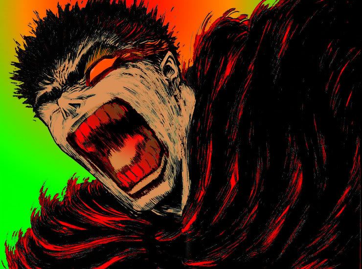
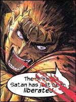
here is another one... it is one from one of my favorite parts of Berserk, can anyone guess?
PS Femto your cool thanks for the advice but I am not into the no lines like I have said in my last couple of posts
here is another one... it is one from one of my favorite parts of Berserk, can anyone guess?
Thank you sir, may I have another
-
Sandman
- Dirty Sennin
- Posts: 2207
- Joined: Thu Apr 28, 2005 9:25 pm
- Location: Life is a bitch in bush Alaska
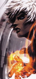
Its not a rainbow, its missing colors for that but I see what you are saying but I need another color and it contrasted well so there you go. I also rushed it alittle but anyway can you guess where this is in the manga??
Hint it is from one of may favorite parts... I posted them in 271 thread...
Hint it is from one of may favorite parts... I posted them in 271 thread...
Thank you sir, may I have another


-
Femto
- Devourer of Children
- Posts: 5784
- Joined: Wed Dec 13, 2006 11:58 pm
- Location: 127.0.0.1
- Contact:
Let me rephrase this one last time because either you don't get it or I'm not explaining myself properly.Sandman wrote:I see it femto... and I dont like it sorry, I am not an asshole I just like what I like and like the lines damn-it
PS Femto your cool thanks for the advice but I am not into the no lines like I have said in my last couple of posts
If you are working with multiple layers in Photoshop, is it possible for you to turn off the layer that has the line artwork and save the file without it so we can see the coloring alone?
I'm not asking that you color it without linework (is that even possible?), I just want to see how the color works by itself.
PS: I don't like that last one.
PPS: The model looks pretty good.
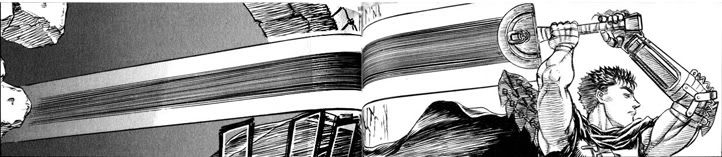
I love it. It's really damn awesome. I would love to see the final version of this.Church wrote:Hey, I was making this a couple of months ago, was going to be for a Half Life 2 mod that never got started, thought i would post it here because it's Beserk related.
still not finished, never get any time =[

I don't think half the toilet seats in the world are as clean as I should like; and only half of those are half as clean as they deserve. - tsubaimomo, July 26, 2010 3:00 am
Heh that HL2 mod looks hot, would of loved to see it in action.
Well its my first post here, thought id post some of the Berserk colourings i had done.


I done this just to try out a new colouring technique, worked pretty well, then i added a light effect (the second pic), and it seemed to add a better feeling to the pic, or is that just me?
Also the protruding of the line art was done intentionally.
And the other colouring i did is in my sig, but ill put up the orignal so you can see what was done.
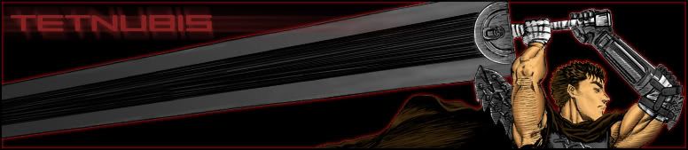
Currently working on a picture of Casca, hope you like.
Well its my first post here, thought id post some of the Berserk colourings i had done.
I done this just to try out a new colouring technique, worked pretty well, then i added a light effect (the second pic), and it seemed to add a better feeling to the pic, or is that just me?
Also the protruding of the line art was done intentionally.
And the other colouring i did is in my sig, but ill put up the orignal so you can see what was done.
Currently working on a picture of Casca, hope you like.
Last edited by Tetnubis on Sun Apr 16, 2006 1:00 am, edited 1 time in total.
-
Buzkashi

- Devourer of Children
- Posts: 5727
- Joined: Wed Jan 12, 2005 12:23 am
- Location: Hiding from the flying beavers..
Ditto. Honestly... great work.
Question to all the color artists out there:
How do you go a bout making the background all nice like those in the above colored pic? I know it may sound nubbish but really I dont know how.
Tetnubis: You think theres a way you can send me one of those in PSD format so that I can see what you did with the layers and shit. Cause I'm really interstind in figuring out more ways to make the shadding and lighting better in the pics.
Thanks Eldo.
As for your questions Buzkashi, to be honest for me its trial and error, i wasnt actually trying to make a good picture here i just wanted to brush up on my skill.
I started on the background in this too which i dont uasually do, but all i did was put the brush on 25% flow and opacity then just kept clicking, trying out various colours, i started with a skin tone colour then used darker tones of it to create darker areas, after that i made a new layer then started doing the same again but with a blue colour.
After i had coloured Gatts and Griffith, i then went back to the BG and used white on 25% again, and just used it around the two to make it lighter.
As for the PSD, Ill upload it onto megaupload or something and PM it to you in a bit, going to get back to the casca pic.
Thanks again.
Oh i also edited my first post because my sig wasnt showing, so you can now see the other pic i did.

I was planning to include the art in chapter 273, but the ones that was posted recently looks so damn good. I think I'll include them in the 272 release when a better raw arises.
Names could be on the artwork as well, otherwise, I'll put it in for you, but no fancy text styles or anything. Glad this thread's alive and I can't wait to see more artwork by you guys.
Names could be on the artwork as well, otherwise, I'll put it in for you, but no fancy text styles or anything. Glad this thread's alive and I can't wait to see more artwork by you guys.
I don't think half the toilet seats in the world are as clean as I should like; and only half of those are half as clean as they deserve. - tsubaimomo, July 26, 2010 3:00 am
Heh, cool, ill be a more active member in that case!
well its finished, nothing spectacular, but still i like it.

And heres the version without the dawn lighting and text change.

Looking at it again, seems very incomplete, i might go back add some more shadows, then again i might not, id rather do a more interesting picture.
Ah well, hope you like it.
well its finished, nothing spectacular, but still i like it.
And heres the version without the dawn lighting and text change.

Looking at it again, seems very incomplete, i might go back add some more shadows, then again i might not, id rather do a more interesting picture.
Ah well, hope you like it.
-
Femto
- Devourer of Children
- Posts: 5784
- Joined: Wed Dec 13, 2006 11:58 pm
- Location: 127.0.0.1
- Contact:
If anyone here is really interested in coloring, checking out this book is a must. There's everything from basic color theory to filters and how to use them effectively.
One of the greatest pieces of advice I got from it:

I think a lot of the stuff here could benefit from that, particularly that Guts and Griffith picture which is flattened because of the lack of contrast.
I like the second version more, by the way.
One of the greatest pieces of advice I got from it:
I think a lot of the stuff here could benefit from that, particularly that Guts and Griffith picture which is flattened because of the lack of contrast.
I like the second version more, by the way.

Tetnubis,Tetnubis wrote:Thanks Eldo.
As for your questions Buzkashi, to be honest for me its trial and error, i wasnt actually trying to make a good picture here i just wanted to brush up on my skill.
I started on the background in this too which i dont uasually do, but all i did was put the brush on 25% flow and opacity then just kept clicking, trying out various colours, i started with a skin tone colour then used darker tones of it to create darker areas, after that i made a new layer then started doing the same again but with a blue colour.
After i had coloured Gatts and Griffith, i then went back to the BG and used white on 25% again, and just used it around the two to make it lighter.
As for the PSD, Ill upload it onto megaupload or something and PM it to you in a bit, going to get back to the casca pic.
Thanks again.
Oh i also edited my first post because my sig wasnt showing, so you can now see the other pic i did.
very great work! i wish i could do a fraction of that colouring.
you need to have a mental image of what should be darker or lighter.
also, could you please post the link if you managed to upload your PSDs.
thanks!
=)

@Femto - Book looks interesting, im surprised that they didnt note that the inking also has a large part of the overall look of the picture. But then again i guess the page is only really refering to the colour.
As for the Guts&Griff pic, i dont think that using the technique that i used could really help the flat look of the finished picture, if i did it in the same style that i did the casca picture, and also went over the orignal line art with the correct colours, im sure that it would result in the finished image looking more 3-dimensional. Thanks for the reference.
@Quest - Thanks, im sure with practice, over time you could manage to do that, or even better, im pretty half assed, so i dont actually work 100% on any one picture. Its bad i know, and the end result of a picture that i worked hard on would look alot better, but i loose motivation fairly fast.
I posted the link in a PM.
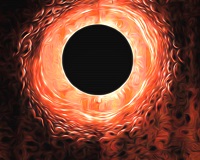
If you don't mind some wallpapers, here are three that I made for my laptop:
http://www.deviantart.com/deviation/27027497/
http://www.deviantart.com/deviation/29223345/
http://www.deviantart.com/deviation/31849522/
I reckon the newest one is sort-of-ok. I don't have the skill to draw my own shit, so I have to rely on what limited knowledge I have of PS, and Miura's awesome art to make my wallpapers >_>