Femto wrote:Still, I'll put it up as an alternative since we have have that youtube mod thingy anyway.
Thanks for that, Australia has shit Internet, and my ISP is shit by default.
I'd love to see it coloured.
Posted: Mon Nov 20, 2006 6:23 am
by ryusenka
Dizzy from 100 Bullets
My attempt at drawing the top of Caska, dunno where her arms went.
Here's a few drawing I did in class while I was bored, sorry about the lines, I did them in my notebook.
I don't care what anyboy says, Wolverine and Robin are awesome.
Posted: Mon Nov 20, 2006 10:04 am
by Buzkashi
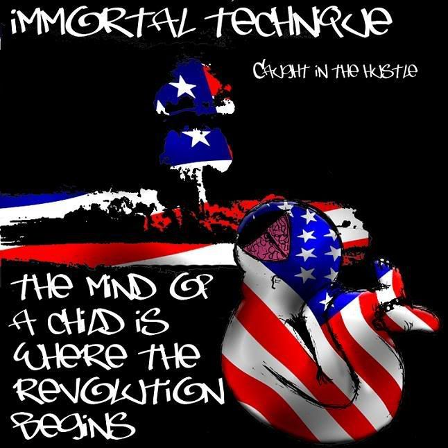
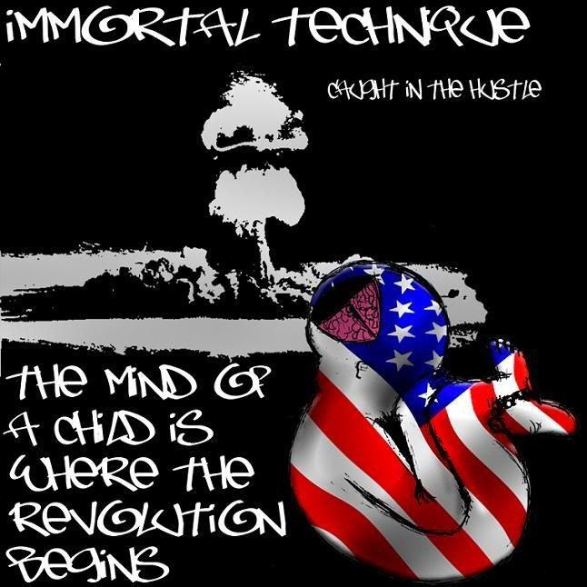
I am currently in a Graphics Arts class. One of the latest assignments I've received requires me to create an original album cover for a piece of music. This is what I got so far so please pick/ critique one as to how I may improve it.
Posted: Mon Nov 20, 2006 10:09 am
by newbified
I personally like the second one more. The first one seems strange because it's got two american flags going in different directions but not overlapping.
Maybe try a single flag that goes down through both?
Posted: Mon Nov 20, 2006 3:45 pm
by ryusenka
The first and the second one don't look very right to me for some reason. They don't look like CD covers to me . But, yea, I would have to agree with newbified, I like the second one more. Maybe you should remove all the text and move around the thing that looks like a fetus around the left, or at least higher then theexplosion in the background. That's just my critique though.
Posted: Mon Nov 20, 2006 6:15 pm
by Buzkashi
Thanks ya. Well with the second american flag one. I thought of that later on. So it was a bit late to use the same flag as on the child.
Posted: Tue Nov 21, 2006 4:19 am
by Fuji Nagase
the second one in terms of graphic art is better. i guess because the point is to make the contrasts of color and pattern clear in terms of defining what the narrative is illustrating, whereas the first one didn't. i was harder to see the picture and what was going on. the second one is clear and the composition is the same but since the flag pattern for the mushroom cloud is take out you can more easily tell thats what it is. i like immortal technique...lets just say a lot. so i have high expectations for it but i actually like this a lot! however i dont know about the flag baby. i love how it looks now but it doenst really show how corrupt america is, in the way he tends to sing it. the flag is so perfect and neat, (maybe its supposed to be that way because its a baby and they are "pure") but i think if you are truly trying to represent Immortal Technique, maybe adding some burn holes or blood stains or something that shows that the flag isn't perfect would be nice to see.
overall, i do like it a lot, especially the composition of the second one. the mushroom cloud and the lettering looks amazing. the eyes are guided throughout the whole picture ( although it is a little congested in the bottom) and so its easy to look at.
Posted: Tue Nov 21, 2006 4:46 am
by ryusenka
Oh yea, I forgot to mention. Can people comment on my drawings? I want to know how I can improve on my drawings. I want to a comic book artist and I'm currently studying anatonomy and perspective. There's no perspective in those drawings but I want to know if they look right or weird. I would REALLY appreciate it if Femto would come and comment, pwease ?
Here are a few more to give an example of my drawing. I was really into anime and mang aa while ago and went crazy trying to make my drawings look like thiers, but now I want to work on a more americanized style.
Posted: Mon Dec 04, 2006 8:12 pm
by psi29a
I think this qualifies as 'art':
Posted: Mon Dec 04, 2006 8:22 pm
by Shaka Zulu
I say this way too often.....but dang that motherfucker is my new hero.
Posted: Mon Dec 04, 2006 8:25 pm
by EnglishJim
Woah! Psi where did you get that? That guy is a fucking legend!
Posted: Mon Dec 04, 2006 10:09 pm
by psi29a
Apparently there was no evidence of photo-shopping... (read the small print).
Posted: Tue Dec 05, 2006 2:24 am
by Gattsblackfalcon
Ahaha that letter is fucking awsome .
Posted: Wed Dec 06, 2006 7:20 am
by EnglishJim
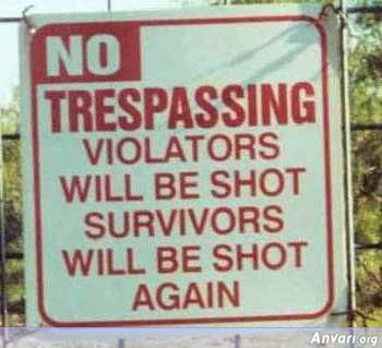
You had better respect the signs...
Posted: Wed Dec 06, 2006 10:03 pm
by Malvado
Gattsblackfalcon wrote:Ahaha that letter is fucking awsome .
yes, yes it was.
Posted: Thu Dec 07, 2006 2:09 am
by Libaax
Buzkashi wrote:Thanks ya. Well with the second american flag one. I thought of that later on. So it was a bit late to use the same flag as on the child.
The second one is great cause the nuclear explosion looks much better without the american flag coloring and the text on the cover looks better too.
The first one has too much of the american flag,one time too many.
As a fan of IM who knows alot about what he sings about the second one looks like an album cover IM would use.
But even in the second one i dont think the american flag coloring is needed cause many of his songs are global, about poor palestian kids etc no need to limit the child on the cover to being only american.
Thats just me though you might feel you must use the flag.
Anyway well done and i wonder if you got a good grade on assigment.
Posted: Mon May 14, 2007 5:05 am
by Femto
Probably my most professional looking work to date:
I'm going to draw a few pages from some actual comic book scrips next.
Posted: Mon May 14, 2007 9:37 am
by Devil_Dante
Pfff, Average, my mom draws better than that.
jk, its f*cking AWESOME!!!! best fan art EVAARRR!!
Posted: Mon May 14, 2007 10:17 am
by LordMune
Ok, yeah, that's pretty cool. The webbing seems a bit too thick though- but in the comics he still uses mechanical webshooters, so he won't have to worry about ruptured wrists, right?
Posted: Mon May 14, 2007 10:36 am
by Eldo
LordMune wrote:but in the comics he still uses mechanical webshooters, so he won't have to worry about ruptured wrists, right?
They're organic now, ever since he died and came back to live again. He also have some stingers somewhere, but hasn't really been used since then.
I'd like to see more.
Posted: Mon May 14, 2007 4:51 pm
by Femto
LordMune wrote:Ok, yeah, that's pretty cool. The webbing seems a bit too thick though- but in the comics he still uses mechanical webshooters, so he won't have to worry about ruptured wrists, right?
Technically, with the way Spidey's hand is positioned, he should be shooting at the floor but I'm pulling a "suspension of disbelief" card here.
It was something I was aware of but went with it anyway for the sake of the drawing.
Posted: Mon May 14, 2007 6:56 pm
by MrFelony
it looks pretty good. i would love to see it colored, because as a monotone color it seems to blend together mainly in the bottom left area where most of the action and overlapping is going on. and i think it was a better choice to suspend disbelief because i think that pose is probably the best, though it'd be interesting to see what it would look like with his arms bent
Posted: Mon May 14, 2007 8:05 pm
by LordMune
This was seriously the only thing I could think of when I first saw it.