Page 11 of 62
Posted: Mon Mar 13, 2006 9:21 am
by LordMune
Sometimes, it feels like I'm the only one who understands myself...
Posted: Mon Mar 13, 2006 9:43 am
by Tempest
LordMune wrote:Sometimes, it feels like I'm the only one who understands myself...
Posted: Tue Mar 14, 2006 3:39 pm
by k3mikal
i dont log into the forums much but whenver i do i find Damien with a really nice avatar, like the current one!
Posted: Tue Mar 14, 2006 6:23 pm
by Gundam_Bobcat
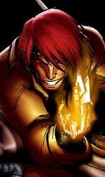
Alright rate mine, ill probably be posting on this thread a lot, i tend to change my avatar.
Posted: Tue Mar 14, 2006 6:29 pm
by Quest
its alright.
did you do a photoshop filter on the background?
Posted: Tue Mar 14, 2006 6:40 pm
by Gundam_Bobcat
yea i threw it together in like 3 min. I was watching the X-Men Cartoon from the 90's and i remembered how much i liked Gambit.
Posted: Wed Mar 15, 2006 3:16 pm
by Libaax
If you like Gambit he looks much cooler in Ultimate X-men. You could probably find a pic of him in UXM to make an av about.
How about my av guys bad or good?
Its made by Marc Silvestri. A cover for Hunter Killer.
Posted: Thu Mar 16, 2006 12:18 am
by Sandman
I like it a little dark though, dont know a lot about it but the weapon looks interesting

I read my sig at the office and just about got the whole crew to piss them selves

Posted: Thu Mar 16, 2006 4:01 am
by Quest
sandman,
regarding your sig, new zealand's cow populations outnumbers their people about 4 to 1.
what does that make new zealand?
=)
Posted: Thu Mar 16, 2006 8:33 pm
by Gundam_Bobcat
Ok, how about this one. Its a much better picture, i think im going to keep this one for awhile.
Posted: Thu Mar 16, 2006 9:39 pm
by Starnum
Yes, much better. 
Posted: Fri Mar 17, 2006 1:38 am
by Damien
Gundam_Bobcat nice avatar, I really like it.
Posted: Fri Mar 17, 2006 1:38 am
by Buzkashi
I was planning on using this one eventually.
Posted: Fri Mar 17, 2006 4:25 pm
by Quest
Buzkashi wrote:I was planning on using this one eventually.
thats a pretty sweet gambit picture.
=)
hows my new sig? i did it myself with photoshop.
Posted: Fri Mar 17, 2006 4:46 pm
by Albator
No kidding. It's very nice, I was planning to do something similar for the site banner, guess it'll have to be something else.
Posted: Fri Mar 17, 2006 5:30 pm
by Quest
thanks, albator!
i was surprised at how good it looks. having a simple layout and all.
making the banner will be difficult with the contraints on proportions. its just too thin for most decent pictures to fit!
Posted: Fri Mar 17, 2006 6:14 pm
by Albator
Well if I remeber well Gutts is sitting on a pole with the moon behind, and the whole picture wight fit in a banner without messing up the proportions. Maybe moving the moon, but that's all.
Posted: Fri Mar 17, 2006 6:18 pm
by Quest
i am kinda skeptical that it will look good in a 800x80 banner.
a lot of his body will have to be cut.
or he will have to be very small.
Posted: Fri Mar 17, 2006 6:26 pm
by Deathbringer
So what you guys think about the sig?
Too simple?

Posted: Fri Mar 17, 2006 6:30 pm
by Quest
is that from hellsing?
damn thats creepy. looks like he is gona lunge out of the screen.
=)
Posted: Fri Mar 17, 2006 6:33 pm
by LordMune
Needs to be cropped and cleaned.
Posted: Fri Mar 17, 2006 6:35 pm
by Tempest
It's too big. 160 pixels is the max height.
Posted: Fri Mar 17, 2006 6:36 pm
by Deathbringer
I see, good thing i posted here first, thanks guys.
Posted: Fri Mar 17, 2006 7:20 pm
by LordMune
Properly applied smart blur does away with the worst of the artifacting, like so;

I figured it was time for a simple, distractingly
hueg sig.
Posted: Sat Mar 18, 2006 3:49 am
by Ayanami
Double post? Gasp!
