Evil_Genius' Berserk community, Kentaro Miura's epic masterpiece, still active and translated. (Please don't ask about older Volumes. Buy from DarkHorse and support Miura.)
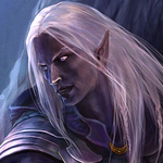
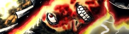
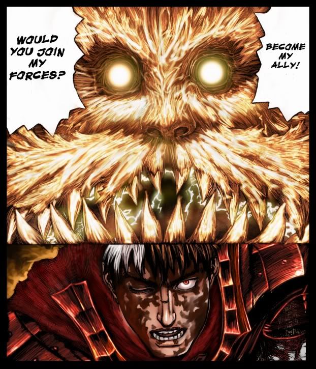
ya you def did a really good job on ganishka. almost looks 3d lol. though im sorta opposite of buz, the burns and what not look alittle too smooth to me.
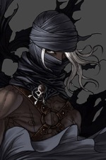
EDIT: also since we havent had berserk in forever how bout some more fan art to take its place . come on people lets see what you've got!
Sandman wrote:Good job there Ollie... how long did you say you had been working with photoshop??? Looks like you have got it down pat
Ahh... My first 'digital painting' attempts were with some old sucky program I don't recall the name of, then Photoshop Elements for practice. I got Photoshop CS2 in the summer of 2005. In general, I've been using Photoshop programs for two years now, I think.
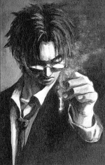
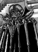
Ogar, you did a really great job, although I think the way you colored Gatt's burns is kind of weak; compared to the rest of the picture it's pretty bland and uniform and flat. I think it would have been better to follow the lineart more strictly in this case, as in the original pages his skin looks crusty and flakey and gross, but in your coloring it just looks... stained or something. That said, the coloring of Gashinka is awesome. It's really strong and totally stands out. (although I don't recall seeing lightening like that inside of his mouth , but I tend to miss details like that at first).
Do you have an art site or account at deviantART? I really would like to see more of your works.
Not to step or your toes but Ogar's Colorings are so good I wouldnt mind seeing them once on every page, until someone else post some art that we can talk about... IMO that is
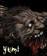
Oh, shi- ermm... i just thought that the burns was blood... *slaps self* All the while going...
OH HE'S BLEEDING AND ITS ON HIS FACE EVERYWHERE ~Lalalala~
That's why it doesn't look quite like burns. And I always pictured Mistah Lightening in that color... dunno why, i'll make some experiments and maybe make another version.
Anyhow, thanks for the comments everyone! And i like that many of you've progressed! Yours was very nice Ollie!
Btw, if you can't guess my deviant then... i don't know...
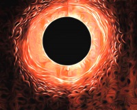
Damn, that's awesome. Ganishka looks like he's full of lightning. Now that's a stormcloud.
Guts was fine either way, I guess it's just up to preference. But Ganishka is definitely cooler on the second one. Especially since that one matches my imagination .
don't worry ogar, i liked ganishka's color in the first one better too . though i guess the 2nd is more true to lightings real color . though i like 2nd guts better than the first lol
Brainpiercing wrote:He's a cloud, I thought he was transparent. On the other side of the mouth is the darkness of the sky behind him. It seems fine to me.
Ogar (and others), may we display your work on EG's site? Full props will be given, but some people don't visit the forum and are dying for news and fun stuff on the EG site.


 and EvilDmitri rocks ftw.
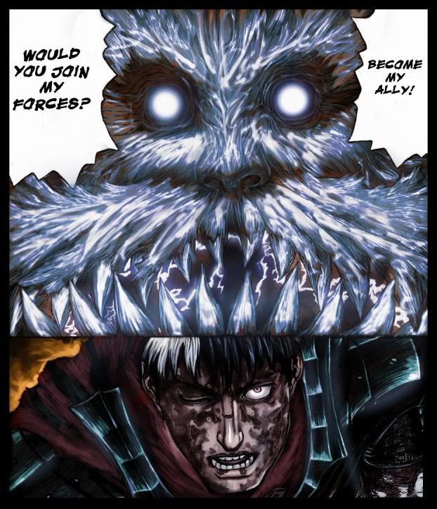

 .
.